The Challenge
Personal Pay’s app had strong usability but lacked design consistency. Interface elements varied in size, brand colors were excessive, and accessibility rules weren’t followed. There was confusion around payments and transfers. The challenge was to build a Design System aligning with the brand while improving clarity and user experience.
The Solution
We analysed the existing product in depth, identifying UX and UI gaps.
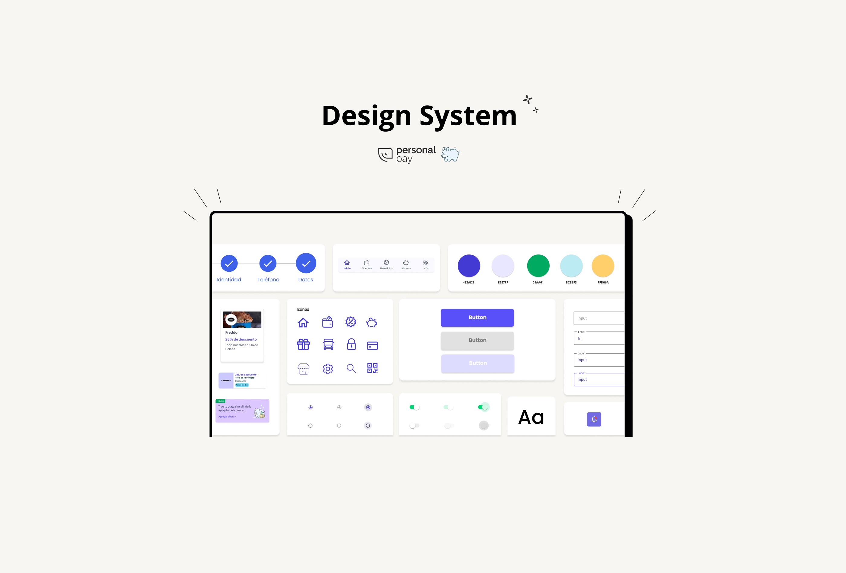
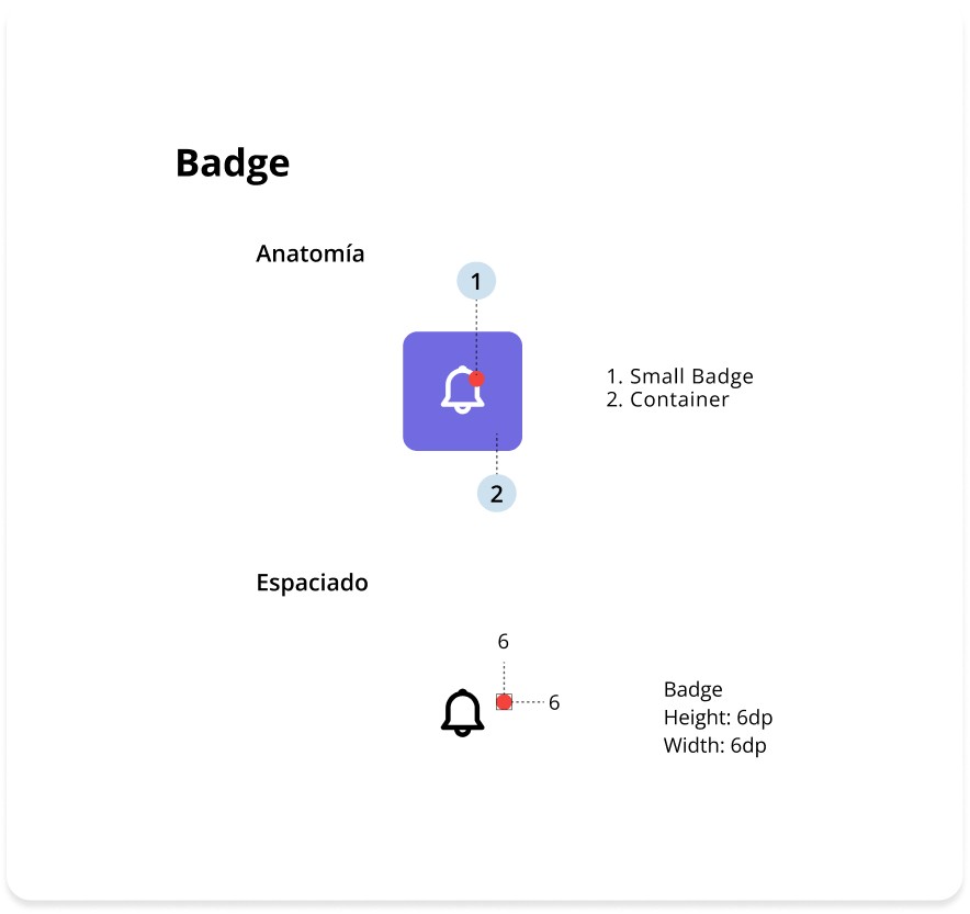
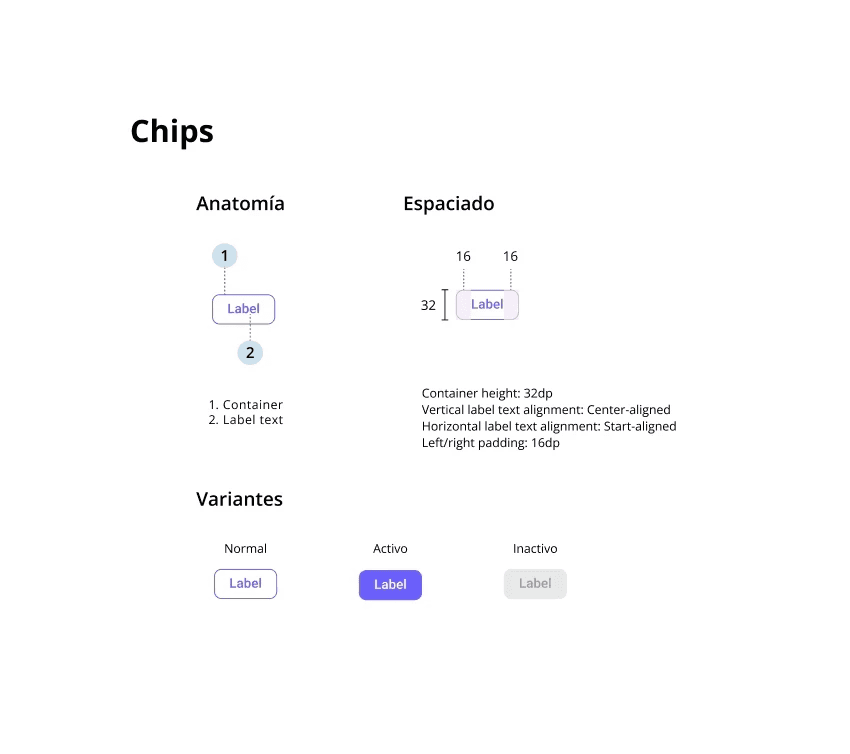
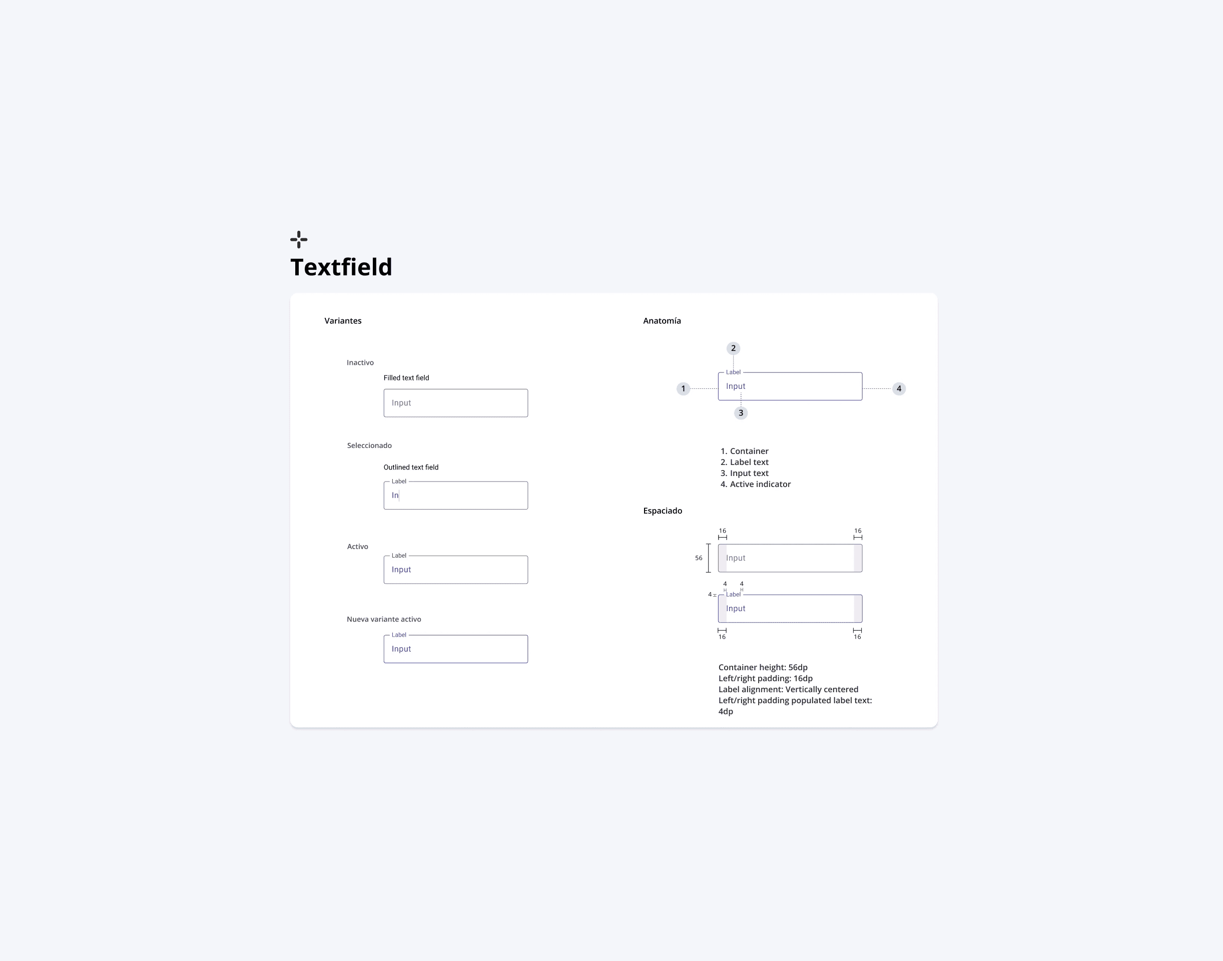
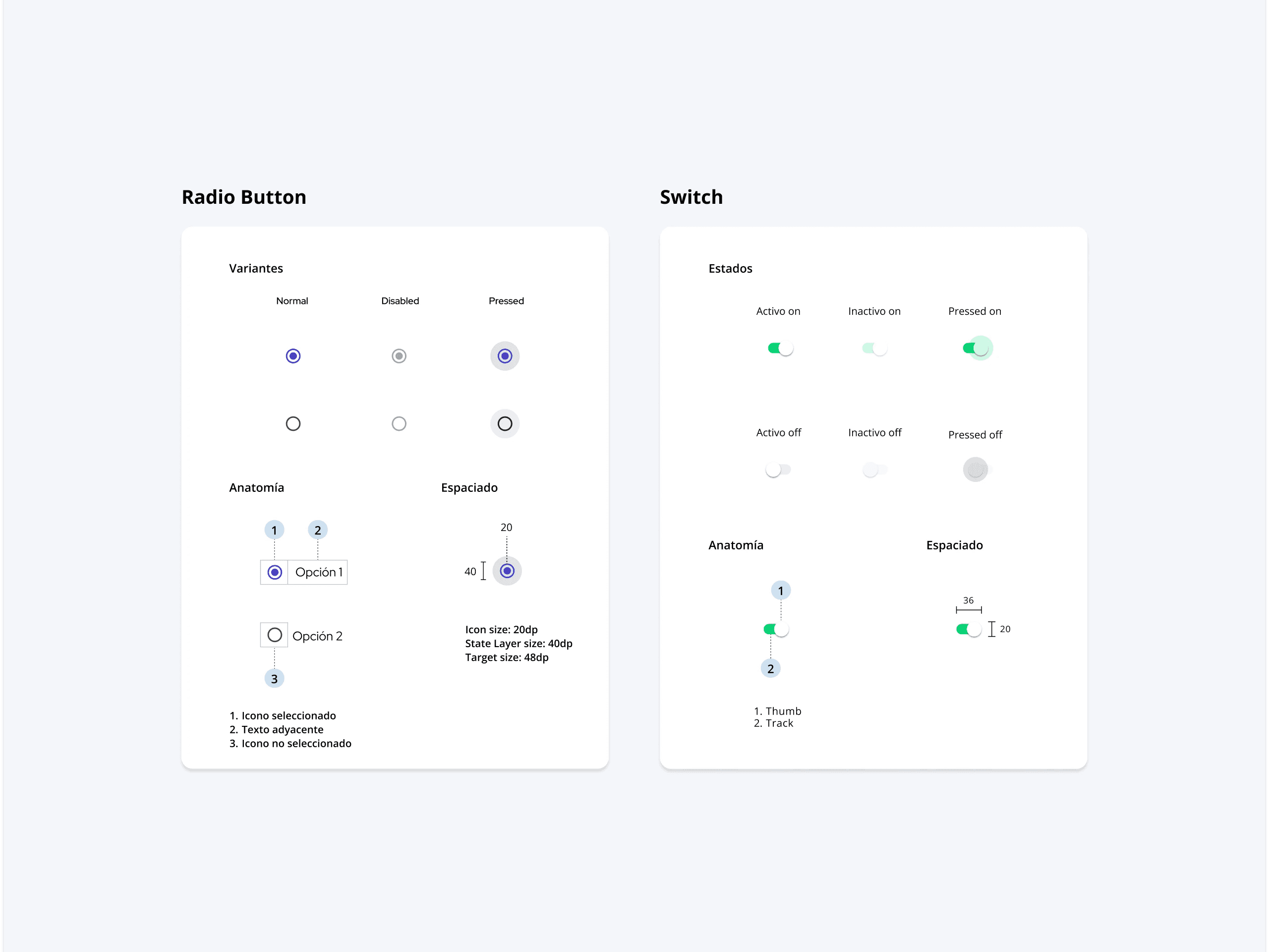
I created a scalable Design System covering typography, colors, grids, and components, ensuring brand alignment and accessibility.
The system was designed to adapt to future product features and maintain consistency across screens, strengthening Personal Pay’s visual identity.


Outcome
The project gave me hands-on experience designing scalable systems. I left with a deeper understanding of design foundations, accessibility standards, and how to build products ready to grow with user and business needs.